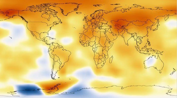
 Global Temperature Anomalies averaged from 2000 to 2004
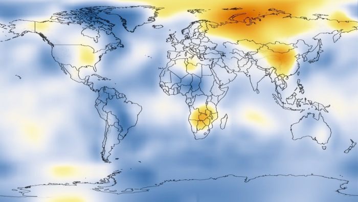
NASA has made a this striking animation that shows a 130-year history of how global temperatures have become warmer in most parts of the world. The polar regions are warming fastest and quickest as is clearly shown. Here’s the temperature scale and more detailed explanation from NASA follows. — Stephen


Global Temperature Anomalies averaged from 1920 to 1924.
Source: NASA/Goddard Space Flight Center Scientific Visualization Studio
Five-Year Average Global Temperature Anomalies from 1880 to 2010
This analysis concerns only temperature anomalies, not absolute temperature. Temperature anomalies are computed relative to the base period 1951-1980. The reason to work with anomalies, rather than absolute temperature is that absolute temperature varies markedly in short distances, while monthly or annual temperature anomalies are representative of a much larger region. Indeed, we have shown (Hansen and Lebedeff, 1987) that temperature anomalies are strongly correlated out to distances of the order of 1000 km
This color-coded map displays a progression of changing global surface temperatures anomalies from 1880 through 2010. The final frame represents global temperature anomalies averaged from 2006 to 2010.

There is a huge change, that is for certain. Show this to the Deniers- they still think we are living in a cooling Holocene.
Massive warming in the North but not so much in the southern hemisphere. Not Global warming for sure.
Only in the Antarctic has warming been less obvious – new updated graphic from NASA here: https://climate.nasa.gov/vital-signs/global-temperature/ The North, especially the Arctic, is really beginning to cook